
How to Turn Listing Photos Into Pinterest Pins That Get Saved

Updated: Aug 28
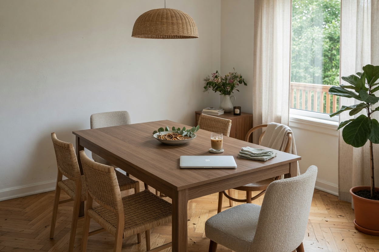
Most hosts already own everything a good Pinterest pin needs. The listing photographer already shot the wide living room angle, the golden-hour porch shot, the styled bedroom, the close-up of the coffee bar. What is usually missing is not more photography, it is a repeatable design pattern for turning those existing photos into pins that get saved and clicked, instead of scrolled past.
This guide walks through how to pick the right source photos, the design elements that consistently perform on Pinterest, the mistakes that quietly sink an otherwise good pin, and a simple weekly workflow you can actually keep up with. None of it requires a graphic design background or a paid designer on retainer, it requires a template and a habit.
Why Your Listing Photos Are Already Pinterest-Ready
Professional listing photography and Pinterest photography want the same things: good light, a clean frame, and a room that reads as aspirational rather than merely accurate. A photographer shooting for Airbnb or a direct booking site is already composing for scroll-stopping appeal, because that is what gets a guest to click into the listing in the first place. That overlap means the raw material for a strong pin library is sitting in the same folder as your listing photos, you rarely need a second photo shoot.
The difference is framing and cropping, not subject matter. Pinterest pins perform best in a vertical 2:3 ratio, roughly 1000 by 1500 pixels, while most listing photos are shot horizontally for the marketplace grid. A wide living room shot that works perfectly as an Airbnb hero image usually needs to be recomposed, cropped tighter, or paired with a second vertical image, before it works as a pin. Treat your listing gallery as a source library, not a finished pin set.
It also helps to think about which rooms actually earn saves. Kitchens, primary bedrooms, outdoor living spaces, and any standout architectural detail, a soaking tub, a fireplace, a mountain or water view, consistently outperform generic hallway or closet shots. Before building pins, go back through the listing gallery and shortlist the five or six images that would stop a scroll on their own merit, then build your design pattern around those.
Choosing the Right Photos for Pin Design
Not every strong listing photo makes a strong pin. A photo built for pin design needs open negative space, a stretch of ceiling, wall, or sky where text can sit without covering the subject. Busy, tightly cropped shots that work fine in a listing gallery often have nowhere for a headline to go once you add one, which is why the widest, airiest shots in the gallery are usually the best pin candidates even if they were not the strongest standalone listing photos.
Vertical and near-vertical shots translate directly. Horizontal shots need one of two treatments: crop into a vertical section that still reads clearly, or place the horizontal photo inside a vertical canvas with a color block or a second photo filling the rest of the frame. A two-photo pin, exterior on top, interior on bottom, for example, is one of the simplest ways to reuse horizontal listing images without losing the parts that make them appealing.
Consistency across the set matters as much as any single image. Pull your photos so every pin shares similar light and color temperature, do not mix a warm, golden-hour porch shot with a cool, overcast interior shot in the same board. Pinterest users scroll through boards, not single pins, so a set that feels like one property with one visual identity earns more repeat saves than a grab-bag of unrelated crops.
Design Elements That Make a Pin Work
A working pin has three layers: the photo, a short headline, and a consistent brand mark. The headline is doing the heaviest lifting, it tells a scrolling user what they are looking at before they have processed the image. Keep it short and concrete: a place name, a feature, or a use case ("Cozy Cabin Near the Trailhead," "Lake House With a Screened Porch") reads faster than a clever tagline and gives Pinterest's search index something literal to match against.
Typography should be legible at thumbnail size, since most users see a pin small before they ever see it large. A bold sans-serif in one or two weights, high contrast against the background (a semi-transparent color band behind the text is an easy fix for busy photos), and no more than two font families per pin keeps the design readable without looking amateurish. Save the decorative script fonts for accents, not headlines.
A small logo or URL in a consistent corner builds recognition over time, but it should stay small, a thin watermark, not a banner. The goal of the design layer is to make the photo more useful, not to compete with it. If someone can screenshot your pin and still remember what property it was without reading the brand mark, the design is doing its job.
Common Mistakes Hosts Make With Pin Design
The most common mistake is treating Pinterest like a second Instagram feed, posting the exact same square crop with no text overlay and hoping it performs. Pinterest is a visual search engine, not a social feed; towns without a headline miss the keyword signal that helps Pinterest understand and surface the image, and square crops waste the vertical space that the app's own layout rewards.
A second mistake is overcrowding the pin, stacking a headline, a subhead, a price, a call-to-action button, and a logo onto one image until nothing stands out. Every additional text element competes with the photo for attention. A single clear headline almost always outperforms a pin trying to say five things at once.
The third mistake is linking every pin straight to the OTA listing instead of a page you control. A pin that links to a blog post, a guide, or your direct booking site keeps the visitor on a page you can update, track, and build an email list from, and it lets you write real, keyword-rich copy around the pin rather than relying on a marketplace listing description you cannot fully control. Save the direct listing link for pins built specifically around booking intent, and use richer landing pages for everything else.
A Simple Weekly Workflow for Turning Photos Into Pins
You do not need a design team to keep a pin library fresh, you need a template and a recurring half hour. Build one or two Canva or similar templates sized for Pinterest (1000 x 1500px), with your logo mark, font pairing, and a text box already placed. From there, the weekly job is dropping in a new photo and swapping the headline, not starting from a blank canvas.
Pair the design work with thephoto order the search tile actually uses and the listing-conversion basics that already drive bookings so pin design does not run ahead of the fundamentals it is supposed to support. A polished pin pointing at a weak listing description will still lose the guest once they click through.
Batch the work seasonally where it makes sense, a fall foliage pin from the same porch shot used for a spring pin, a cozy-fireplace crop from a winter listing photo, so one photo shoot supports multiple pin cycles across the year instead of a single one-off post. A modest, consistent library of ten to fifteen well-designed pins, refreshed a few times a year, will outperform a burst of fifty rushed pins posted once and never revisited.
Related Reading
Keep reading on same-cluster Crest & Cove pages that stay on labeled local lines without costume-corridor copy.
Montrose Shoulder: No Borough Peak-3, April Hole on Neighbors
DIY vs. Hire in Many, LA: Why Independent Hosts Still Run Most Listings
DIY or Hire in Depoe Bay: What the Numbers Say for STR hosts
DIY vs Hire in Seattle: Independents Still Write Most Listings
Financing a Springfield, MA Rental Without a Neighbor City Year
Financing a Grove, OK Rental: What a DSCR Underwriter Actually Wants
What It Actually Costs to Start a Grove OK STR: The One Published Fee
Frequently Asked Questions
What size and format should a listing photo be for Pinterest?
Pinterest favors a vertical 2:3 ratio, roughly 1000 by 1500 pixels, while most listing photos are shot horizontally for the OTA gallery. Plan to crop into a vertical section that still reads clearly, or combine a horizontal photo with a second image or a color block to fill out a vertical canvas. Treating the listing gallery as a source library rather than a finished pin set makes this recomposition step routine instead of a recurring bottleneck.
Which listing photos work best as pins?
Wide, airy shots with open negative space, a stretch of ceiling, wall, or sky, give a headline somewhere to sit without covering the room. Kitchens, primary bedrooms, outdoor living areas, and standout architectural details like a soaking tub or a mountain view consistently earn more saves than hallway or utility shots. Shortlisting five or six standout images from the existing gallery before building anything keeps the design pattern anchored to photos that can actually carry text.
Do I need a professional designer to build pins?
No. A free tool like Canva with one or two saved templates, sized correctly at 1000 by 1500 pixels with a logo and font pairing already placed, lets a host swap in a new photo and headline in a few minutes. The template carries the design work; the host only supplies the photo and the words each week. That repeatable setup is what keeps a pin library going without hiring a designer on retainer.
How much text should go on a pin?
One short, concrete headline is usually enough, a place name, a feature, or a use case reads faster than a clever tagline. Stacking a headline, a subhead, a price, and a call-to-action onto a single image makes every element compete for attention, and that crowding typically hurts performance rather than helping it. A single clear line paired with a strong photo consistently outperforms a pin trying to say five things at once.
Should a pin link directly to the Airbnb or Vrbo listing?
Not always. Linking to a blog post, a guide, or a direct booking page keeps the click on a page the host controls and can help build an email list, while a straight OTA link works best reserved for pins built specifically around booking intent. Richer landing pages also let a host write keyword-rich copy that a marketplace listing description simply does not allow.
How often should a host publish new pins?
Consistency beats volume. A modest library of ten to fifteen well-designed pins, refreshed a few times a year with new crops or headlines pulled from the same photo set, tends to outperform a large one-time batch that never gets revisited. Batching the work seasonally, a fall crop from a porch shot, a cozy-fireplace crop pulled from a winter listing photo, keeps one photo shoot supporting several pin cycles across the year.
Can the same photo be reused across multiple pins?
Yes. A single photo can support several pins over time simply by changing the headline, the crop, or the seasonal framing, a fireplace shot built for a winter pin can be reframed later as a general cozy-stay pin. Reusing photos this way, rather than sourcing something new for every post, is what makes the weekly workflow sustainable without a fresh shoot every season.
What is the single biggest design mistake hosts make on Pinterest?
Treating Pinterest like a second Instagram feed, posting an unedited square crop with no headline and hoping it performs. Pinterest works as a visual search engine, not a social feed, so a pin without text misses the keyword signal that helps Pinterest surface the image, and a square crop wastes the vertical space the platform's own layout rewards.
What makes a pin design feel consistent across a whole board?
Pulling photos so every pin shares similar light and color temperature keeps a board reading as one property with one visual identity, rather than mixing a warm golden-hour porch shot with a cool, overcast interior in the same set. Since Pinterest users scroll through boards rather than single pins, that visual consistency earns more repeat saves than a grab-bag of unrelated crops.
Where should a logo or watermark sit on a pin?
A small logo or URL in a consistent corner builds brand recognition over time, but it should stay small, a thin watermark, not a banner competing with the photo. If someone could screenshot the pin and still remember which property it was without reading the brand mark, the design layer is doing its job correctly rather than fighting the image for attention.
Work with Crest & Cove Creative
A listing photographer's photos sit unused the moment the shoot ends, when the same images could become Pinterest pins that keep pulling new eyes to the listing months after the gallery was shot.
We help hosts turn existing listing photos into a repeatable Pinterest pin pattern instead of a one-off graphic that never gets reused. Send us your best gallery shots and we will show you the crop and caption pattern that saves.
Reach out at crestcove.co or (256) 998-7502.


Comments