
Small-Space Photography That Makes a Studio Feel Bigger

Updated: Aug 28
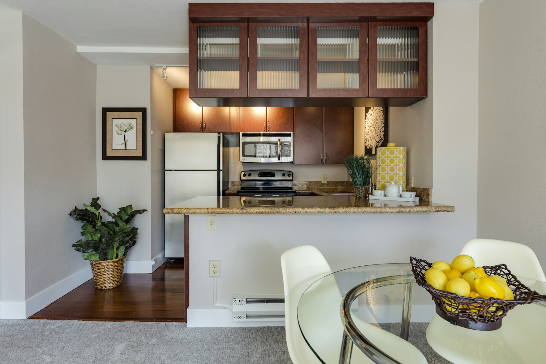
A studio or one-bedroom rental rarely looks as good on a phone screen as it feels in person. Wide-angle distortion, cluttered sightlines, and mismatched light temperatures shrink a room before a guest ever reads the square footage. The fix is not a wider lens or a brighter filter. It is a short list of camera, staging, and editing habits that make a small space photograph honestly larger without misleading anyone who books it.
None of this requires a professional photographer on retainer. A host who understands sightlines, light balance, and shot order can produce a listing gallery that reads as spacious, calm, and trustworthy using a smartphone or an entry-level mirrorless camera. The goal on every shot is the same: show the guest the room they will actually walk into.
Why Small Rooms Photograph Smaller Than They Feel
A room feels larger in person than in a photo because your eyes constantly re-scan it, filling in depth your brain assumes is there. A single flat image has to do that work in one frame, so anything that breaks the sense of depth, a cluttered foreground, a shadow that swallows a corner, or a lens that bends straight lines, reads as cramped even in a room that is comfortable to stand in.
Mixed light temperature is the most common culprit in small units. A warm lamp next to a cool window light creates two color casts in the same frame, and the eye interprets that visual noise as clutter rather than as light. Closing blinds partway, turning off mismatched lamps, or shooting at a consistent time of day removes that noise before it ever reaches the camera.
Height matters as much as light. Shooting from standing eye level exaggerates how close the walls are in a small room, because the camera sees the same converging lines a guest would see while standing still and staring straight ahead. Lowering the camera to roughly chest height, closer to where a seated guest's eyeline falls, opens up the perceived ceiling height and floor space in the same shot.
Camera and Lens Choices for Tight Interiors
A moderately wide lens, roughly 20mm to 24mm on a full-frame equivalent, or the standard wide setting on most smartphone cameras, captures enough of a small room without the barrel distortion that ultra-wide lenses introduce. Anything wider tends to bow the walls and stretch furniture near the edges of the frame, which makes a studio look bigger for a second and then look fake once a guest notices the warped doorframe.
Shoot corner-to-corner rather than straight into a wall. A diagonal angle from one corner of the room toward the opposite corner captures two walls and the floor in a single frame, which gives the eye more depth cues than a flat, head-on shot of a single wall. This is the single highest-leverage framing change for a small bedroom or studio living area.
Keep the camera level. A tilted horizon reads as amateur and subtly distorts how large the room appears, because the brain uses the horizon line as a size reference. Most phone cameras have a built-in level or grid overlay, turn it on and use it for every interior shot, not just the hero image.
Staging and Angles That Add Perceived Space
Clear the floor before every shoot. An empty sightline from the doorway to the far wall is the fastest way to make a small room look larger, because the eye travels that path uninterrupted. Remove floor lamps, ottomans, rugs with busy patterns, and anything stacked against a wall that isn't part of the room's permanent furniture.
Use furniture scale intentionally. A single arm chair reads as more spacious than a two-seat loveseat crammed into the same footprint, because the chair leaves visible floor around it. If a unit already has larger furniture that can't be swapped, angle the shot to show the gap between the furniture and the nearest wall rather than framing the furniture edge-to-edge.
Light the far wall, not just the foreground. A wall that fades into shadow at the back of the frame visually caps the room short of where it actually ends. Opening blinds fully, turning on any ambient lighting near the back wall, and shooting during the hour after sunrise or before sunset, when daylight is soft and directional rather than harsh, keeps the entire depth of the room visible instead of letting the back third disappear into shadow.
Common Mistakes That Make a Small Unit Look Smaller
Shooting straight into a corner with the camera at eye level is the single most common mistake, it compresses the two visible walls into what looks like a narrow hallway. Pair that with a cluttered nightstand or a bed pushed flush against two walls, and even a genuinely comfortable studio starts to look like a storage unit in the photo.
Over-processed HDR editing is the second mistake. Pushing shadows too bright and highlights too dark to compensate for a small window flattens the depth cues a viewer relies on to judge scale. A light, natural edit that keeps a believable range between the darkest and brightest parts of the frame will always read as more trustworthy, and, counterintuitively, more spacious, than an artificially brightened one.
Skipping the wide establishing shot is the third mistake, and it's specific to small units. Hosts sometimes default to close-up detail shots, a nice faucet, a folded towel, because the room itself feels too small to photograph well. But a gallery with no wide shot forces guests to mentally assemble the layout from fragments, which reads as evasive even when nothing is being hidden. One honest wide shot per room, even a modest one, earns more trust than five flattering close-ups.
A Pre-Shoot Checklist for Micro-Units and Studios
Before picking up the camera: clear the main floor sightline, turn off any light source with a different color temperature than the rest of the room, open blinds fully, and set the camera to a level, chest-height position aimed corner-to-corner rather than wall-to-wall.
During the shoot: take the wide establishing shot first in every room, then move closer for two or three supporting detail shots that reinforce what the wide shot already showed, a made bed, a clear counter, a stocked shelf. Shoot the kitchen and the main living or sleeping area first, since those are the images guests scan fastest when comparing listings.
After the shoot: edit for natural light balance rather than maximum brightness, crop out any stretched or distorted edges rather than trying to fix them with software, and order the final gallery so the widest, most orienting shot of the unit leads. A guest who understands the layout from the first photo books with fewer surprises and leaves fewer complaints about size.
Related Reading
Keep reading on same-cluster Crest & Cove pages that stay on labeled local lines without costume-corridor copy.
How to Photograph Small Spaces So They Look Inviting (Not Cramped)
Gettysburg PA Work Turning Remote Stays: AirROI Pins, Not Leftover
DIY vs. Hire in Many, LA: Why Independent Hosts Still Run Most Listings
DIY or Hire in Depoe Bay: What the Numbers Say for STR hosts
DIY vs Hire in Seattle: Independents Still Write Most Listings
Financing a Springfield, MA Rental Without a Neighbor City Year
Financing a Grove, OK Rental: What a DSCR Underwriter Actually Wants
What It Actually Costs to Start a Grove OK STR: The One Published Fee
Frequently Asked Questions
What lens or camera setting works best for a small studio?
A moderate wide angle, roughly 20mm to 24mm full-frame equivalent, or your smartphone's standard wide lens, captures a small room without the bowed walls and stretched furniture an ultra-wide lens produces. Keep the camera level and shoot corner-to-corner instead of straight into a wall. This one setting choice affects nearly every other photo you take in the unit.
Should I shoot with the lights on or use only daylight?
Pick one, not both. Mixed color temperature between a warm lamp and a cool window is one of the most common reasons a small-space photo looks cluttered and off. Either turn off mismatched lamps and shoot with natural daylight, or close the blinds partway and light the room evenly with consistent-temperature bulbs.
What angle makes a small room look larger?
A diagonal, corner-to-corner angle shot from roughly chest height captures two walls and the floor in one frame, giving the eye more depth cues than a flat shot straight into a single wall. Standing at full eye level exaggerates how close the walls are, so lowering the camera slightly helps the room read as more open.
Do I need to declutter before every listing photo?
Yes, and it matters more in a small unit than a large one. An unobstructed sightline from the doorway to the far wall is the fastest way to make a small room read as spacious. Floor lamps, busy rugs, and anything stacked against a wall break that sightline and should come out of frame before you shoot.
Is it okay to use a wider lens to make the space look bigger?
Not a good idea. Ultra-wide lenses distort straight lines and stretch furniture near the frame edges, which can make a room look artificially large for a moment before it starts to look fake. A guest who arrives to a room that photographed larger than it is will leave a review about it, so a moderate wide lens with honest framing protects both the booking and the review.
How many photos does a studio or micro-unit need?
A wide establishing shot of each functional area — sleeping, kitchen, bathroom — followed by two or three supporting detail shots per area is usually enough. Skipping the wide shot and relying only on close-ups makes guests work to mentally assemble the layout, which reads as evasive even when nothing is actually being hidden.
What editing mistakes make small rooms look worse?
Heavy HDR processing that pushes shadows too bright and highlights too dark flattens the depth cues a viewer needs to judge scale. A natural edit that preserves believable contrast between light and dark areas reads as both more trustworthy and more spacious than an over-brightened one.
Which room should lead the photo gallery?
Whichever wide shot most clearly orients a guest to the layout, usually the main living or sleeping area, or the kitchen. Leading with the widest, most orienting image reduces size-related surprises at check-in and cuts down on complaints that the space looked bigger in photos than it did in person.
Work with Crest & Cove Creative
Small-space photos fail when wide angles promise a room the guest cannot walk into on arrival. Honest framing keeps the stay and the gallery on the same square footage.
We help independent hosts shoot and sequence small-space listings so scale stays honest without looking cramped. Lead with what the room actually holds for overnight guests. Skip tricks that invent square footage. Send the live listing if the first five photos still oversell the floor plan.
Reach out at crestcove.co or (256) 998-7502.


Comments